Relative Strength Index Multi Time frame RSII am always checking RSI on 1hr, 4Hr and Day RSI.
Having to switch is annoying so wrote this little script to show RSI on upto 5 time frames.
The green bold line is the current time frame, and you can change the other 4 to what you prefer.
If one time frame is over sold or overbought you can change the back to indicated a buy or sell etc.
Anyway thought I would share it.
If you like it, please click the like button.
Cari dalam skrip untuk "relative strength"


AJCrows RSIRelative Strength Index with indicator lines at 20, 30, 50, 70 and 80 marks. Use settings to show/hide these lines, and to choose appropriate colors.


relative strength to SPX500This is the indicators showing the stock relative strength comparing with SPX500.
positive means the stock is strong than spx500
negative means weak than spx500

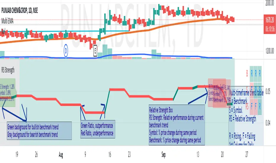
Measure of Relative Strength on Trend ReversalDescription
The Measure of Relative Strength on Trend Reversal displays the relative strength of the symbol vis-a-vis a benchmark based on the trend reversal of the benchmark. At the end of the trend (i.e. when the trend of the benchmark moves from Uptrend to Downtrend, or vice-versa) the strength (measure) of the symbol's performance with respect to the benchmark is calculated. Additionally, the change% of the symbol and the benchmark are calculated and displayed. This 3 information is helpful in determining the relative performance of the symbol with respect to the broader benchmark trend.
Example
For example, consider that the benchmark turned from a downtrend to an uptrend, then at the last bar of the downtrend, the "RS Strength%", the "Symbol%" and the "Benchmark%" shall be displayed. The RS Strength% shows the outperformance/underperformance of the symbol with respect to benchmark for the duration of the downtrend. A negative% means underperformance and a positive% means outperformance. The Symbol% is the % change in the price of the symbol during the downtrend and likewise, Benchmark% is the selected benchmark for the downtrend.
Working
These counters are reset at the beginning of each trend reversal of the benchmark. When the performance of a symbol is stronger on benchmark downtrend for successive times, it is an indication of a strong stock in the making once the larger market recovers.
The trend of the benchmark is established on the basis of a lookback period that is configurable at the input. The trend is established on the reversal of the key moving average by the lookback that is configured. A downtrend in the benchmark is denoted by a gray background and a uptrend in the benchmark is denoted in green.
The input is explained below:
Comparative Symbol - The benchmark. Nifty50 is the default value
Chart Type - Line or Candle plot of the Relative Strength with respect to Benchmark
Lookback for benchmark trend - Lookback to determine the trend of the benchmark
Display RS Strength% - Option to disable the RS strength value and focus only on the RS trend
Ways to use
Backtests show that this indicator is best used on a Weekly Timeframe, with 10 lookback for the benchmark. Any symbol that is constantly beating the benchmark on a downtrend is a strong candidate for outperforming once the market recovers.
On selecting a group index as the benchmark it is possible to identify the strong stocks in the group, those with the highest RS Strengths are the outperformers of the group.
Multi Period Relative StrengthMulti Period Relative Strength Indicator
This indicator is meticulously designed around the fundamental concept of relative strength, providing a powerful tool to assess an instrument's performance against peers or a benchmark index within the same asset class. Tailored for short-term swing trend analysis, it equips traders with the insights needed to make informed decisions based on prevailing relative strength dynamics.
More about Relative Strength: www.investopedia.com
Key Features:
Dual Period Analysis:
The indicator conducts a dual-period analysis, scrutinizing relative strength across two distinct period—a fast period and a slow period. This approach allows for a comprehensive evaluation of relative strength dynamics.
Visualization:
Slow RS is visually depicted as a green cloud above the zero line showing relative strength or a red cloud below it showing relative weakness. This visual representation aids in assessing the underlying instrument's performance against its peer over the past 3 months (slow period).
Fast RS is visually presented as green bars above the zero line showing relative strength or red bars below it showing weakness. This visual cue helps evaluate the performance of the underlying instrument against its peer over the last week (fast period).
Positive Relative Strength:
When both the fast and slow periods exhibit positive values, it signifies sustained strength in the current instrument over both the past 3 months and the last week.
Divergence Evaluation:
A positive fast period coupled with a negative slow period signals a robust relative strength trend over the past 3 months, but with a recent decline in the last week. Traders may consider adjusting positions, such as reducing or exiting, in response to this divergence.
Strength Building Scenario:
Conversely, a negative fast period paired with a positive slow period indicates relative weakness over the past 3 months, coupled with an increasing trend in the last week. This scenario may present an opportunity to gradually build positions, particularly if the 3-month relative strength turns positive.
Strategic Decision Points:
Traders can leverage these signals strategically to manage portfolios, adjusting positions based on the nuanced interplay between short-term and longer-term relative strength trends.
Risk Mitigation Strategies:
By interpreting the indicator signals, traders can implement effective risk mitigation strategies, including position downsizing, exits, gradual position building, or short covering. These actions align with the prevailing relative strength dynamics.
In summary, the Multi Period Relative Strength Indicator offers a nuanced and actionable perspective on an instrument's relative strength. By examining both short-term and 3-month trends, traders can make well-informed decisions to optimize their trading strategies and portfolio management.

Saral Relative StrengthRelative Strength Indicator
### Overview
The Relative Strength (RS) Indicator is a robust tool designed to measure the performance of a security relative to a benchmark or another security. Unlike traditional indicators, this RS Indicator calculates the outperformance or underperformance in percentage terms, providing a clear and concise comparison.
The equation for calculation can be found in the code itself. This equation compares how much a security's price has changed over a given period (len) relative to the change in price of a benchmark over the same period. The result is expressed as a percentage, showing whether the security has outperformed or underperformed the benchmark. A positive RS value indicates outperformance, while a negative value signals underperformance.
Basically, this indicator is an enhanced version of 'Relative Strength' indicator of 'BharatTrader' Sir with added features like automatic divergence plotting, color-coded filled area and sector names for NSE F&O securities. Default values for some of the parameters are based on discussion by Subhadip Nandy Sir in Trader's Talk with Mr. Rohit Katwal.
### Input Parameters:
Source: The price of a security used in the calculation, with the default being the 'close' price.
Comparative Symbol: Ticker ID of the comparative security, with the default set to NIFTY 50.
Period-RS: The period for calculating the RS line, with a default of 22. The RS line measures the relative performance of the security against the benchmark, helping to identify outperformance or underperformance over time.
Period-MA: The period for calculating the Simple Moving Average (SMA) overlay on the RS line, with a default of 11. The SMA provides a smoothed view of the RS line, helping to identify trends more clearly.
Lookback - Zero Line Trend: Zero Line Trend look-back period, used to determine the angle of the RS line, with a default of 5. This parameter influences the color of the Zero Line based on whether the RS line’s angle is positive or negative.
Lookback - Divergence: Divergence look-back period, with a default of 2, used to detect divergence between the price and the RS line.
Display MA Line: Controls the display of the SMA line. When enabled, the SMA line is plotted over the RS line to indicate trend strength.
Toggle RS Color on MA Crossovers: Controls the color of the RS line. If disabled, the RS line is purple. If enabled, the RS line changes color based on its position relative to the SMA: green for RS > MA, red for RS < MA.
Display Zero Line Trend: Controls the display of the Zero Line. If disabled, the Zero Line is black. If enabled, the Zero Line’s color changes to green or maroon based on the RS line’s angle over time.
Display Divergence: Controls the display of divergence dots on the RS line, indicating potential reversal points.
Display Filled Area: Controls whether the area between the Zero Line and the RS line is filled with color. The fill color changes based on the relationship of the RS line with the SMA & Zero Line as given below.
- Dark Green: RS > 0 and RS > MA, indicating strong outperformance.
- Light Green: RS > 0 and RS < MA, indicating weakening outperformance.
- Dark Red: RS < 0 and RS < MA, indicating strong underperformance.
- Light Red: RS < 0 and RS > MA, indicating weakening underperformance.
Display Sector Name: Controls the display of sector names for NSE F&O securities, helping to plot RS with sectoral indices.
### Key Features:
RS Line:
The RS line represents the relative performance of a security against a benchmark over a specified period (default 22). It helps traders identify whether the security is outperforming or underperforming the benchmark.
SMA Overlay:
A Simple Moving Average (SMA) line is plotted over the RS line, with a default period of 11. The SMA provides a smoothed trend of the RS, making it easier to identify consistent performance trends.
Trend-Sensitive Zero Line:
The Zero Line’s color adapts based on the RS line’s trend:
- Green: Positive angle of the RS line, indicating upward momentum.
- Maroon: Negative angle, indicating downward momentum.
The color can be toggled, with an option to display the Zero Line in black.
Divergence Detection:
Automatically detects and highlights divergences.
- Positive Divergence: RS line rises while the price falls, marked by blue dots.
- Negative Divergence: RS line falls while the price rises, marked by black dots.
Color-Coded Fill Area:
The area between the RS line and the Zero Line is filled with color to visually distinguish different market conditions, with Dark and Light colors providing insight into the strength of the performance:
- Dark Green: Indicates strong outperformance (RS > 0 and RS > MA), suggesting the security is showing significant strength compared to the benchmark.
- Light Green: Indicates weakening outperformance (RS > 0 and RS < MA), signaling that while the security is still outperforming, its strength is diminishing.
- Dark Red: Indicates strong underperformance (RS < 0 and RS < MA), showing the security is significantly weaker than the benchmark.
- Light Red: Indicates weakening underperformance (RS < 0 and RS > MA), suggesting the security is still underperforming but may be regaining some strength.
Sectoral Strength:
Displays sector names for NSE F&O securities, helping users to compare the RS of individual securities with their respective sectoral indices. Comparative Security can be changed easily based on this sector name. Users need not to remember sector names for individual securities.
If any security is not categorized in a specific sector, CNX500 has been considered as a default sector for NSE F&O securities. For other securities, NIFTY50 has been considered as a default sector.

Stock Strength IndexScript Title: Stock Strength Index made by Vishal R Janjire
Description:
The Stock Strength Index combines several advanced technical analysis tools into one comprehensive Pine Script indicator designed to provide a nuanced view of market strength and trends. This script integrates Relative Strength (RS), Commodity Channel Index (CCI), and additional trend confirmation mechanisms to deliver actionable insights for traders.
( Must Read )
Important parameter read before use this indicator
0. Zero line green means stock is in up trend and if it is red means down trending.
1. Zero line is green it means stocks is outperforming its index that is Nifty 50 ( but dont consider its results on nifty itself that is it will not work only on nifty 50)
2. Zero line is red it means stocks is underperforming its index that is Nifty 50
3. bubble is confirmation tool when it show green bubble on zero line it means on short time frame it want go up trending and vise versa
4. Always remember higher time frame is greater than chart time frame like day vs hour
Key Features:
5. Best suitable time when higher time frame is 15 minutes and chart time is 5 minute for intraday trading. for short swing use HTF 1 Day and chart time is 1 hour or 2 hour.
1. Relative Strength (RS) Analysis:
- Calculation: Measures the performance of the base symbol relative to a comparative symbol over a specified period.
- Visualization: Plots the RS value with color-coded lines to indicate bullish (green) or bearish (red) conditions based on crossovers. Users can toggle the RS color based on its value or trend direction.
- Trend Analysis: Displays a simple moving average (SMA) of RS to visualize trend strength and direction. The SMA’s color changes to indicate rising or falling trends.
2. Commodity Channel Index (CCI):
- Current Timeframe CCI: Calculates the CCI for the current timeframe to assess price momentum.
- Higher Timeframe CCI: Computes the CCI for a higher timeframe to provide a broader market perspective.
- Background Color: Highlights the chart background in green or red based on whether both current and higher timeframe CCIs are above or below zero, respectively.
3. Alerts:
- CCI Alerts: Set up alerts for key CCI crossovers, including when both CCIs are above or below zero, or when CCI crosses key levels (100 and -100) on either timeframe.
4. Trend Confirmation:
- Price Confirmation: Uses price and its moving average to identify bullish or bearish divergence, with visual bubbles plotted on the chart to confirm potential trade signals.
5. Customization Options:
- RS Parameters: Adjust settings for RS period, comparative symbol, and whether to display reference labels or the zero line.
- CCI Parameters: Configure CCI lengths for both current and higher timeframes and select the source of the CCI calculation.
Concepts Underlying Calculations:
- Relative Strength (RS): Measures the relative performance of the base symbol compared to another symbol, adjusted over a specified period to capture momentum and trend strength.
- Commodity Channel Index (CCI): Calculates the deviation of the price from its average to identify overbought or oversold conditions and potential reversal points.
- Simple Moving Average (SMA): Smooths the RS values to highlight trends and potential trend reversals.
This indicator is designed for traders seeking a comprehensive tool that combines multiple analytical methods into one cohesive system. It aims to offer a clearer view of market trends, strengths, and potential trade opportunities based on a blend of relative strength and momentum indicators.
---
This description provides a detailed overview of the script's functionality and customization options while ensuring clarity and compliance with the publishing rules.

Black RSI (Multi Symbol RSI)📌 GENERAL OVERVIEW
Black RSI (Multi Symbol RSI) is an indicator with multiple-RSI (multi-symbol support), It is a powerful indicator designed for analyzing the relative strength of multiple financial instruments within a single chart. This indicator essentially combines multiple instances of the Relative Strength Index (RSI) for different symbols, allowing traders to compare and contrast market conditions for a broader, simultaneous analysis of various assets. By tracking RSI across multiple assets, traders can identify broader market trends, and sector rotations, or pinpoint relative strengths and weaknesses among different instruments. Please check the below sections for details.
Black RSI (Multi Symbol RSI) Indicator Features Summary:
+ Multiple RSI with multi-symbol ◢
This indicator plots Primary+3 multiple RSI for multiple symbols at once. For instance, it could simultaneously show the RSI of indices (e.g., SPX, NASDAQ) or stocks within a sector, providing insights into how these assets are moving relative to one another.
+ Custom Divergence Module ◢
It allows the user to select the divergence source among the multiple RSI (Primary, 1st, 2nd or 3rd RSI) and displays regular/hidden bullish/bearish divergence for selected RSI only.
+ Custom RSI Moving Average/BBs ◢
It allows the user to select the RSI moving average/BBs source among the multiple RSI (Primary, 1st, 2nd or 3rd RSI) and displays moving average/BBs for selected RSI only.
+ Alert Triggers ◢
The indicator can incorporate alert functions that notify the user when an RSI threshold (e.g., overbought or oversold levels) is crossed for any of the selected symbols.
📌HOW TO USE IT
Confirm Trends Across Symbols: Use the indicator to confirm trends across multiple assets. For example, if most symbols within a sector or index are showing RSI levels above 50, it may indicate a bullish trend in that sector. Conversely, if most RSIs are below 50, it may signal bearish sentiment.
Spot Divergences: Look for RSI divergences across symbols, which can hint at potential reversals. For instance, if most symbols show declining RSI levels while a few have increasing RSI, it could indicate relative strength in those few, making them candidates for closer watch.
Identify Overbought/Oversold Conditions: By observing the RSI levels of multiple symbols, you can identify when certain assets are overbought (typically RSI > 70) or oversold (typically RSI < 30). When multiple assets show similar RSI levels, this can indicate broader market sentiment or sector momentum.
Sector Rotation Analysis: In longer-term trading or portfolio rebalancing, a Multi-RSI Multi-Symbol indicator can help detect sector rotation patterns by showing which sectors are gaining strength (higher RSI) and which are weakening, facilitating informed sectoral shifts.
Use in Conjunction with Other Indicators: The Multi-RSI can serve as a supporting indicator alongside trend indicators like Moving Averages or Bollinger Bands, helping to confirm entry and exit points. For example, if a symbol’s RSI shows an overbought condition and it aligns with a resistance level from a Moving Average, this could strengthen a sell signal.
Customization: Customize the settings to match your trading style. For instance, day traders might prefer a shorter RSI period and timeframes, while swing traders may benefit from longer timeframes and smoother RSI.
⚙️Black RSI (Multi Symbol RSI) SETTINGS
Black RSI (Multi) Dashboard ◢
+ 1st RSI: Enable/Disable 1st RSI
+ 2nd RSI: Enable/Disable 2nd RSI
+ 3rd RSI: Enable/Disable 3rd RSI
RSI Primary Tools ◢
+ RSI Moving Average/Bollinger Bands: Enable/Disable RSI Moving Average/Bollinger Bands
+ Smooth RSI: Enable/Disable Smooth RSI (for Primary RSI)
+ RSI Divergence: Enable/Disable Divergence for user-selected RSI
RSI Secondary Tools ◢
+ RSI OB/OS Color Bars: Enable/Disable RSI OB/OS Color Bars for user-selected RSI
+ RSI OB/OS Highlights: Enable/Disable OB/OS Highlights for user-selected RSI
+ Background: Enable/Disable RSI Background
+ Primary RSI Settings ▾
- Override Primary RSI Symbol: Allows the user to select the symbol for Primary RSI
- Primary RSI Length: User input primary RSI length value
- Primary RSI Source: User primary RSI source selection
- RSI Line Thickness: User input line thickness value for primary RSI
- Primary RSI Colors:
- OB/OS Highlights: Enable/Disable OB/OS Primary RSI Highlights
- RSI Overbought Threshold: The user can set the RSI overbought threshold value. This Overbought Threshold value will also be applied to All RSI (Primary, 1st, 2nd, 3rd) and "RSI Divergence overbought condition" and "RSI OB/OS Highlights"
- RSI Oversold Threshold: The user can set the RSI oversold threshold value. The lower band (oversold line) of RSI. This Oversold Threshold value will also be applied to All RSI (Primary, 1st, 2nd, 3rd) and "RSI Divergence oversold condition" and "RSI OB/OS Highlights"
+ 1st RSI Settings ▾
- Override 1st RSI Symbol: Allows the user to select the symbol for 1st RSI
- 1st RSI Length: User input 1st RSI length value
- 1st RSI Source: User 1st RSI source selection
- RSI Line Thickness: User input line thickness value for 1st RSI
- 1st RSI Colors:
- OB/OS Highlights: Enable/Disable OB/OS 1st RSI Highlights
+ 2nd RSI Settings ▾
- Override 2nd RSI Symbol: Allows the user to select the symbol for 2nd RSI
- 2nd RSI Length: User input 2nd RSI length value
- 2nd RSI Source: User 2nd RSI source selection
- RSI Line Thickness: User input line thickness value for 2nd RSI
- 2nd RSI Colors:
- OB/OS Highlights: Enable/Disable OB/OS 2nd RSI Highlights
+ 3rd RSI Settings ▾
- Override 3rd RSI Symbol: Allows the user to select the symbol for 3rd RSI
- 3rd RSI Length: User input 3rd RSI length value
- 3rd RSI Source: User 3rd RSI source selection
- RSI Line Thickness: User input line thickness value for 3rd RSI
- 3rd RSI Colors:
- OB/OS Highlights: Enable/Disable OB/OS 3rd RSI Highlights
+ RSI Bands & Threshold Settings ▾
- RSI Middle Band: Allows the user to plot optional RSI band on the RSI Oscillator
- RSI Bullish Band: Allows the user to plot optional RSI band on the RSI Oscillator
- RSI Bearish Band: Allows the user to plot optional RSI band on the RSI Oscillator
+ Primary RSI Smooth Settings ▾
- Type: The user selected Smooth MA type for Primary RSI. With RSI Smooth enabled, it will also affect Primary RSI Divergences detection (all divergences will be plotted according to the "Smoothed RSI line")
- Length: User input Smooth MA length value for Primary RSI
+ RSI Moving Average Settings ▾
- MA/BB RSI Source: Allows the user to MA/BB source selection
- MA/BB Enable/Disable: Allows the user to select Moving average only, BBs only or Both to display on the RSI Oscillator
- RSI Moving Average Colors: Allows the user to select Bullish/Bearish colours of RSI Moving Average
- RSI Moving Average Type: Allows the user to select RSI MA Type
- RSI Moving Average Length: User input RSI MA length value
- RSI Moving Average Thickness: User input RSI MA thickness
- Bollinger Bands Colors: Allows the user to select BBs colours
- BB StdDev: user input Bollinger Bands standard deviation value
+ RSI Divergence Settings ▾
- Divergence RSI source: User selection of divergence source .
- Divergence source: User selection of divergence source . "oscillator" (divergence detection with high/low or close of RSI), "price" (divergence detection with high/low or close of price)
- Bull price source: User selection of Bull price source. Bull price source: "Low" (low of price divergence detection), "Close" (close of price divergence detection) (linked to "price" in "Divergence source")
- Bear price source: User selection of Bear price source. Bear price source: "High" (high of price divergence detection), "Close" (close of price divergence detection) (linked to "price" in "Divergence source")
- Low/High left bars: How many candles to compare on the left side of a candle when deciding whether it is a pivot. The lower the number is, the earlier pivots (and therefore divergences) will be signalled, but the quality of those detections could be lower.
- Low/High right bars: How many candles to compare on the right side of a candle when deciding whether it is a pivot. The lower the number is, the earlier pivots (and therefore divergences) will be signalled, but the quality of those detections could be lower.
- Maximum lookback bars: The maximum length of a divergence (number of bars). If a detected divergence is longer than this, it will be discarded.
- Price threshold: User selection of Price threshold, higher values more lines
- RSI threshold: User selection of RSI threshold, higher values more lines
- Show Lows: Displays lows of RSI
- Show Highs: Displays highs of RSI
- Show Divergence as:
- Line Style:
- Line thickness: User input divergence line thickness value
- Label Transparency: it could reduce label mess on the oscillator line, input "100" for label text only without label background
- Labels Text Color: User label text colour selection
Auto Text Color > Auto colour change of label text according to Dark/Light chart theme
- Bull Divergences: Enable/Disable of Bull divergences
> Color: User selection of Bull divergence color
> Potential Bull: It will plot potential regular bull divergence with a dotted line.
- Bear Divergences: Enable/Disable of Bear divergences
> Color: User selection of Bear divergence color
> Potential Bear: It will plot potential regular bear divergence with a dotted line.
- Hidden Bull Div: Enable/Disable of Hidden Bull divergences
> Color: User selection of Hidden Bull divergence colour
> Potential H.Bull: It will plot potential hidden bull divergence with a dotted line.
- Hidden Bear Div: Enable/Disable of Hidden Bear divergences
> Color: User selection of Hidden Bear divergence colour
> Hidden Bear divergence: It will plot potential hidden bear divergence with a dotted line.
> Regular Bull oversold only: It will show Regular Bullish RSI divergences in the oversold zone only, RSI oversold threshold can be configured in the "Primary RSI Settings" section.
> Regular Bear overbought only: It will show Regular Bearish RSI divergences in the overbought zone only, RSI overbought threshold can be configured in the "Primary RSI Settings" section.
+ RSI OB/OS Colored Bars Settings▾
- OB/OS Bar RSI Source: User selection of OB/OS Bars RSI source .
- Overbought Bar Color: User RSI OB Bars colour selection
- Oversold Bar Color: User RSI OS Bars colour selection
+ Overbought/Oversold Highlights ▾
- OB/OS Highlights RSI Source: User selection of OB/OS Highlights RSI source .
- Overbought Highlights : Enable/Disable Overbought Highlights
- Oversold Highlights : Enable/Disable Oversold Highlights
- Transparency: Gradient transparency of highlighted area
+ RSI Line & Label Settings ▾
- Show Symbol label: Enable/Disable each RSI symbol label.
- RSI line offset: Shifts the RSI to the left or the right on the given number of bars, Default is 0
+ Background Setting ▾
- Custom Background Color: User selection of Background color
Feedback & Bug Report
If you find any bugs in this indicator or have any suggestions, please let me know. Please give feedback & appreciate it if you like to see more future updates and indicators. Thank you

RedK Relative Strength Ribbon: RS Ribbon and RS ChartsRedK Relative Strength Ribbon (RedK RS_Ribbon) is TA tool that plots the Relative Strength of the current chart symbol against another symbol, or an index of choice. It enables us to see when a stock is gaining strength (or weakness) relative to (an index that represents) the market, and when it hits new highs or lows of that relative strength, which may lead to better trading decisions.
I searched TV for existing RS indicators but didn't find what I really wanted, so I put this together and added some additional features for my own use. It started as a simple RS line with new x-weeks Hi/Lo markers, then evolved into what you see here in v1.0 with the ability to plot a full RS chart in regular or HA candle types. Hope this will be useful to some other growth traders here on TV.
What is Relative Strength (RS)
------------------------------------
(RS is a comprehensive concept in TA, below is a quick summary - please research further if it's not already a familiar topic)
Relative Strength (RS) is a technical concept / indicator used mainly by growth / swing / momentum traders to compare the performance of one security or asset against another. RS measures the price performance of a specific security relative to a benchmark, such as an index or another asset. It's not to be confused with the famous Relative Strength Index (RSI) technical indicator
For example, In the context of comparing a stock's relative strength to the SPY (S&P 500) index, the relative strength calculation involves dividing the stock's price or price-related value (e.g., close price) by the corresponding value of the SPY index. The resulting ratio (and its trend over time) indicates the relative performance of the stock compared to the index.
Traders and investors use relative strength analysis to identify securities that have been showing relative strength or weakness compared to a benchmark, which can help in making investment decisions or identifying the "market leaders" and potential trading opportunities.
There are so many books and documentation about the RS concept and its importance to identify market leaders, especially when recovering from a bear market - if you're interested in the concept, please search more about it and review some of that literature. There's also a more detailed definition of Relative Strength in this article on Invstopedia
RedK RS_Ribbon features and options
---------------------------------------------------
The indicator settings provide many options and features - see the settings box below
- Change / choose base symbol
The default is to use SPY as the base symbol - so we're comparing the chart's symbol to a proxy of the S&P 500 - Some traders may prefer to use the QQQ - or other index or ETF that acts as a proxy for the industry / sector / market they are trading
- RS Calculation / RS line
we use the simple form of the RS calculation,
RS = closing price of current chart symbol / closing price of the base symbol (default is SPY) * 100
some RS documentation will use the Rate of Change (RoC) - but that's not what we're using here.
- The RS_Ribbon
* Once the RS line is plotted, it made sense to add couple of moving averages to it, to make it easier to observe the trend of the RS and the changes in that trend as you can see in the sample chart on top.
* The RS_Ribbon is made up of a fast and slow moving averages and will change color (green / red) based on detected trend RS direction - the 2 MA types and lengths can be changed until you get the setup that provides the best view for you of the RS trend over time. My preferred settings are used as defaults here.
- Identifying New (x)Week Hi/Lo RS Values
* Most traders would be interested when the calculated RS hits a new 52-week high or low value.
* There are cases where we may want to see when a new RS Hi/Lo has been hit for a different period - for example, a quarter (13 weeks)
* the number of weeks can be changed as well as adjusting the numbers of trading days per week (if needed for certain symbols/exchanges)
- Working with Different Timeframes
* Now these "markers" will only be available in the daily and weekly timeframes and there is a good reason for that, it's not the fact that i'm lazy :) and that enabling this in timeframes lower than 1D would have been some heavy lifting, but the reality is that with RS, we're really interested if a "day's close" hits a new RS high or low value against the moving window of x weeks (and the weeks close also) - if you think of this more, at lower TF, RS can hit a lower value that never end up registering on the daily closing and that causes a lot of visual confusion. So i took the "cleaner way out" of that issue.
* note that you can choose a different timeframe for the RS_Ribbon than the chart - if you do, please make sure the chart is at a lower timeframe than the indicator's - (and in that case remember to hide the candles because they won't make much sense)
i wanted to leverage TV's built-in multi-Timeframe (MTF) support with the caveat that using the indicator at lower TF with a chart at a higher TF (example chart at 1Wk and indicator at 1D) will show inaccurate results. If this sounds confusing, keep the indicator TF same as the chart.
the example here shows a 2-Hr chart against 1D RS_Ribbon
- Using RS Charts and RS Candles
* Beside the ability to plot the RS "closing" value with the RS line, the indicator provides the ability to show a "full" RS Chart with candles that represent the relative values of open, high, low. and close against the base symbol.
* the RS Charts can be used for regular chart analysis, for example, we can identify common chart patterns like Cup & Handle, VCP, Head & Shoulder..etc using these charts .. which can provide some edge over the price charts
* for the Heikin Ashi fans, I added the ability to choose classic or HA candles for the chart. note you have to enable the option to show the RS candles first before you choose the option to switch to HA.
The chart below shows a side-by-side comparison on the 2 RS chart types
Closing remarks
-----------------------
* RS is a good way to identify market/sector leaders (who will usually recover from a bear market before others) - and enable us to see the strength that comes from the broader makrket versus the one that comes from the stock's own performance and identify good trading opportunities
* I'll continue to update this work and alerts will come in next version - but wanted to check initial reaction and value
* as usual, if you decide to use this in your chart analysis, it's necessary to combine with other momentum, trend, ...etc indicators and do not make trading decision only based on the signales from a single indicator

Adaptive and Static Relative Strength OverlayThis indictor combines adaptive and static relative strengths and displays the strength in a unique colour coding on the bars.
With this the one can view the performance of both the relative strengths in one indicator and overlay-ed on the price chart.
Adaptive Relative Strength - Date is identified based on market scenarios. It will change based on how the market trends in the future.
Static Relative Strength - Date is fixed (123 sessions). Roughly corresponds to 6 months.
The (default) colour coding is:
If "Both" is selected:
ars > 0 and srs > 0 = Blue
ars <=0 and srs <= 0 = Maroon
Orange otherwise (Any of ars or srs is negative)
If "Only ARS" is selected:
ars > 0 = Blue
Maroon otherwise
If "Only SRS" is selected:
srs > 0 = Blue
Maroon otherwise
Additionally the ARS and the SRS will be marked as labels on the bars corresponding to the reference dates.
The current ARS and SRS values will be market as label on the last bar.
Source can be any valid source, close is selected by default.
Default benchmark is "Nifty 50" the NSE Indian benchmark. This can be changed.
Breakout Detection using EMAs and Mansfield Relative StrengthThis script identifies breakout opportunities based on a combination of price action, volume, and relative strength. It is designed for daily timeframe charts and helps traders pinpoint strong bullish setups with the following criteria:
Price Action: Stock price is above both the 10-day EMA and 5-week EMA.
EMA Trends: The 10-day EMA is above the 20-day EMA, and the 5-week EMA is above the 10-week EMA, confirming bullish momentum.
Customizable Parameters: Customize the index for the Mansfield Relative Strength, the volume multiplier, and the price breakout look-back period.
Price Breakout: The price is at a 3-month high, indicating strength.
Volume Breakout: A volume spike occurs, surpassing the 20-day average volume by a user-defined multiplier.
Features:
Generates clear breakout signals with a green triangle below the bar.
Integrated Mansfield Relative Strength for relative performance analysis.
Alerts for when all conditions are met, ensuring you never miss an opportunity.
How to Use:
Add this script to a daily chart of your chosen stock.
Look for green triangle signals indicating a potential breakout.
Adjust the parameters to suit your trading strategy and preferred index for the Mansfield Relative Strength.
This tool is ideal for swing traders looking to combine technical analysis with relative strength metrics for high-conviction bullish setups.

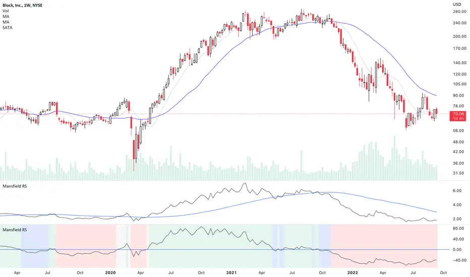
Mansfield Relative Strength (Original Version) by stageanalysisThe Mansfield Relative Strength ( Mansfield RS ) is one of the core components of the Stan Weinstein's Stage Analysis method as discussed in his classic book Stan Weinstein's Secrets for Profiting in Bull and Bear Markets .
The Mansfield RS measures the relative performance of the stock compared to an index such as the S&P 500, or to another stock etc.
However, this should not to be confused with the popular RSI (Relative Strength Index developed J. Welles Wilder), which is a momentum oscillator that measures the speed and change of price movements on a single stock.
The Mansfield RS indicator consists of the Relative Strength comparison line versus the S&P 500 (default universal setting, but can be edited), and the "Zero Line" – which is the 52 week MA of the Relative Strength line, that's been flattened to create the oscillator style.
How to use the Indicator:
Outperforming – Above the Zero Line
When the Relative Strength line crosses above the Zero Line (it's flattened 52 week RS MA), it is outperforming the index or stock that it's comparing against, and so it is showing stronger relative strength.
Underperforming – Below the Zero Line
When the Relative Strength line crosses below the Zero Line (it's flattened 52 week RS MA), it is underperforming the index or stock that it's comparing against, and so it is showing weaker relative strength.
Settings:
When you first add the indicator is has a coloured background, with a green tint for a postive RS score, and a red tint for a negative RS score. However, this can be turned off, or edited in the indicator settings, in the Style tab. So you can change the colors or remove it and just have the RS line and zero line showing. Both of which can also be edited in the settings.
Change the symbol that it compares against. The default is the S&P 500. But for crypto you might want to use Bitcoin for example. Or you might want to compare against competing stocks in the same peer group, or against the industry group or sector. The choice is yours. But the S&P 500 is a universal measure for the Mansfield RS. So I would recommend leaving it on that unless you have a particular reason to change it as mentioned.
MA Length is also an editable setting. This creates the Zero Line. So it will affect the values of the Mansfield RS if you change it. 52 is the default setting, and is set as such for the weekly chart. So I'd recommend not editing it on the weekly chart, but for other timeframes, different settings can be used.
(CD|RS) Caruso Divergence Relative StrengthCaruso Divergence Relative Strength (CD|RS) helps an investor to identify when a security does not make a lower low vs a benchmark. The standard application is to compare a stock to the S&P 500 (SPX). If the SPX makes a lower low and the stock does not, it displays significant Relative Strength.
This indicator allows you to select both your benchmark for comparing against as well as how far back to make the analysis by selecting the pivot lookback (how many prior ‘pivots’ or ‘market lows’ back to compare against).
Divergences can appear when markets are weak, and they make lower lows, but they can also appear in uptrends as stocks and indexes make higher highs. CD|RS also identifies when RS takes place “On Strength.” If the security and its benchmark both decline but the security can make new highs above its prior peak before the benchmark, it is once again displaying relative strength. Therefore CD|RS is helpful in finding Divergence Relative Strength in both up and down trends.
CD|RS works on any timeframe.
CD|RS has an accompanying indicator called CD|RS Signal which helps display the divergence in a different format and can be placed in a separate pane if the user wishes to keep the price chart clean.

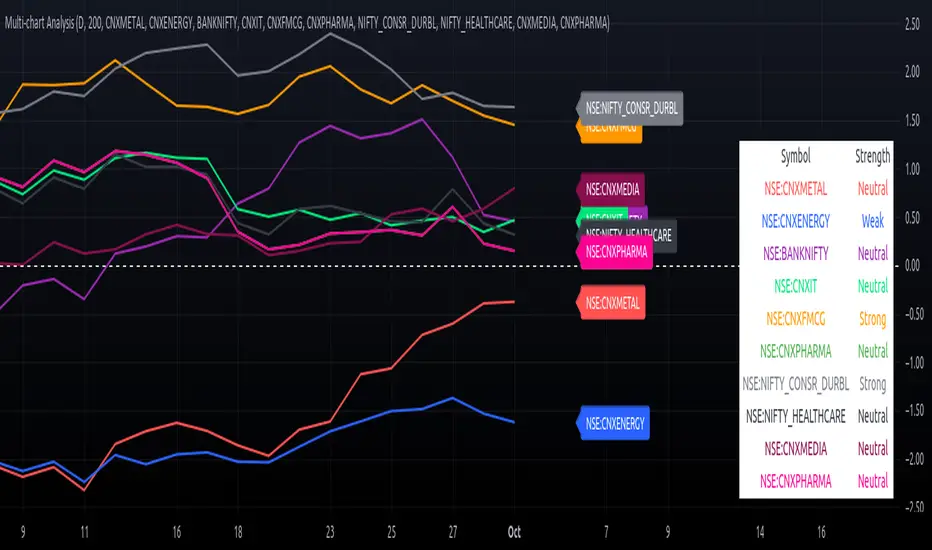
Multi-Chart Relative Strength Oscillator[ChartGalaxy]The Multi-Chart Relative Strength Oscillator is a powerful tool designed to compare the relative strength of up to 10 different market symbols (such as indices, stocks, or commodities). By normalizing each symbol's performance, this oscillator highlights which symbols are showing strength or weakness relative to each other over a selected time period.
Key Features:
Multiple Symbols Comparison: Compare up to 10 different symbols simultaneously.
Oscillator Calculation: Each symbol's price is normalized and converted into an oscillator, allowing for easy comparison of relative strength
Custom Timeframes: Choose any resolution (e.g., daily, weekly) for analyzing the symbols.
Dynamic Labeling: Each symbol is labeled on the chart for easy identification with color-coded labels that match the plotted lines.
Strength Classification: Symbols are classified as "Strong", "Neutral", or "Weak" based on their performance relative to others.
Optional Symbol Table: A table of the symbols and their strength is displayed on the chart, giving a quick overview of the current market conditions.
How it Works:
Symbol Input: The user can input up to 10 market symbols (such as indices or stocks) they wish to compare.
Oscillator Calculation: The indicator calculates the normalized value of each symbol over the selected time period, adjusting for standard deviation to create a relative strength oscillator.
Visual Comparison: The symbols are plotted as oscillating lines on the chart, color-coded for easy differentiation. Additionally, labels appear on the right side of each plot to indicate the symbol.
Strength Assessment: Each symbol is classified as Strong/Weal/Neutral
Use Cases:
Sector Rotation Analysis: Compare different sectors (e.g., Energy, Technology, Healthcare) to see which sectors are gaining or losing relative strength.
Asset Comparison: Analyze a group of stocks, commodities, or other assets to determine which are outperforming or underperforming.
Market Overview: Get a broad overview of the market by comparing key indices and sectors to gauge the overall market sentiment.
Customization Options:
Resolution Selection: Users can select their preferred timeframe for analysis (e.g., daily, weekly).
Custom Symbol Selection: Input any symbol supported by TradingView to compare performance.
Visual Clarity: Each symbol is plotted with distinct colors, and a label with the symbol’s name appears alongside the chart, making it easy to identify each line.
This indicator is ideal for traders looking to conduct sector analysis, asset comparison, or relative strength studies across multiple symbols, providing them with an intuitive and easy-to-read visual tool.
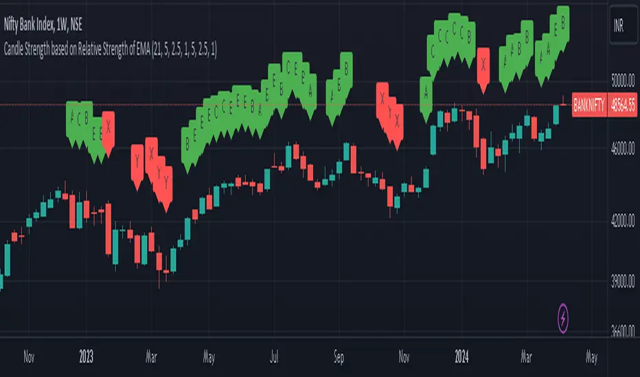
Candle Strength based on Relative Strength of EMAOverview:
The EMA-Based Relative Strength Labels indicator provides a dynamic method to visualize the strength of price movements relative to an Exponential Moving Average (EMA). By comparing the current price to the EMA, it assigns labels (A, B, C for bullish and X, Y, Z for bearish) to candles, indicating the intensity of bullish or bearish behavior.
Key Features:
Dynamic EMA Comparison: The indicator calculates the difference between the current price and the EMA, expressing it as a percentage to determine relative strength.
Configurable Thresholds: Users can set custom thresholds for strong, moderate, and low bullish or bearish movements, allowing for tailored analysis based on personal trading strategy or market behavior.
Clear Visual Labels: Each candle is labeled directly on the chart, making it easy to spot significant price movements at a glance.
Usage:
Trend Confirmation: The labels help confirm the prevailing trend's strength, aiding traders in decision-making regarding entry or exit points.
Risk Management: By identifying the strength of the price movements, traders can better manage stop-loss placements and avoid potential false breakouts.
Strategy Development: Incorporate the indicator into trading systems to enhance strategies that depend on trend strength and momentum.
How It Works:
The script calculates the EMA of the closing prices and measures the relative strength of each candle to this average.
Bullish candles above the EMA and bearish candles below the EMA are further analyzed to determine their strength based on predefined percentage thresholds.
Labels 'A', 'B', and 'C' are assigned for varying degrees of bullish strength, while 'X', 'Y', and 'Z' denote levels of bearish intensity.
Customization:
Users can adjust the EMA period and modify the strength thresholds for both bullish and bearish conditions to suit different instruments and timeframes.
Best Practices:
Combine this indicator with volume analysis and other technical tools for comprehensive market analysis.
Regularly update the thresholds based on market volatility and personal risk tolerance to maintain the effectiveness of the labels.
Price Relative / Relative StrengthThe Price Relative indicator compares the performance of one security to another. This indicator can be used to compare the performance of a stock against a benchmark index, such as the S&P 500, or its sector/industry group. This makes it possible to determine if a stock is leading or lagging its peers.
The Price Relative is used to gauge relative strength, which is important when it comes to stock selection. Many portfolio managers compare their performance to a benchmark, such as the S&P 500. Their goal is to outperform that benchmark. In order to achieve this goal, managers often look for stocks that are showing relative strength. Enter the Price Relative. The Price Relative rises when a stock shows relative strength and is outperforming its benchmark. Conversely, the Price Relative falls when a stock shows relative weakness and is underperforming its benchmark.
Source: school.stockcharts.com
This script allows the user to
Add a new indicator pane for Price Relative (PR)
Edit the benchmark symbol (Comparative Symbol)
Edit or hide the moving average
Quickly determine if the symbol is outperforming or underperforming its benchmark
Quickly determine if the symbols is trending higher or lower based on a simple moving average
Stochastics Oscillator with Buy/Sell Indicator [iSTAGs]iSTAGs "Stochastics Oscillator" with Buy/Sell Indicator
Overview
The Stochastics Oscillator is a versatile trading indicator designed to provide comprehensive insights into market momentum and potential price reversals. With its multi-layered approach, it incorporates a blend of oscillators, smoothed averages, and relative strength measures to deliver actionable trading signals.
Disclaimer
This indicator is provided for study purposes only . While it may assist in identifying potential buy and sell opportunities, please note:
1. False Signals: The buy/sell indicators may generate false signals. Always validate signals using additional analysis or tools.
2. Trading Strategies: Use appropriate exit points and stop-loss levels as part of your overall trading strategy.
3. No Guarantees: Do not rely solely on this indicator for trading decisions. Market conditions may change, and no indicator guarantees accurate results.
4. Strategy Testing: The strategy associated with this indicator is not tested, and backtesting features are not available at this time.
Key Features
1. Stochastics Oscillator
• Combines the smoothed ranges of price movement to identify overbought and oversold conditions.
• Inbuilt signal lines helps pinpoint potential crossovers for trend reversals.
2. Zones Highlighting
• Clearly visualized zones for:
o Overbought (70–100): Caution for potential reversals.
o Bullish (0–40): Positive momentum.
o Bearish (0 to -40): Negative momentum.
o Oversold (-70 to -100): Potential buying opportunities.
3. Buy and Sell Signals
• Primary Buy/Sell Indicator: Highlighted directly on the chart for ease of use.
• Potential Buy/Sell Signals: Secondary indicators based on advanced crossover conditions that can generate early signals.
4. RSI Integration
• Realtime RSI value display for an additional layer of confirmation.
• Color-coded RSI values to easily interpret market strength:
o Red: Overbought (>80)
o Orange: Strong momentum (70–80)
o White: Neutral (30–70)
o Blue: Weak momentum (20–30)
o Green: Oversold (<20)
5. Limited Customizable Visuals
o Clean and color-coded plots and fills make it intuitive to identify trends and trading opportunities at a glance.
How to Use
1. Trading Signals:
• Use buy/sell shapes and flags for identifying potential entry and exit points.
• Combine primary buy/sell indicator and secondary buy/sell signals for higher confidence.
2. Trend Confirmation:
• Monitor the oscillator and signal crossovers alongside zone fills to gauge market direction.
3. RSI Analysis:
• Keep an eye on the RSI value and its color coding for confirmation of overbought or oversold conditions.
Settings
• Enable/Disable Features: Customize the visibility of Buy/Sell indicators, Potential Signals, and RSI display.
• Editable Zones: Adjust zone colors and ranges to suit your trading strategy.
Conclusion
The Stochastics Oscillator is a powerful tool for traders seeking to enhance their technical analysis. Its layered approach provides clarity, precision, and adaptability for a wide range of trading strategies, whether you're a scalper, swing trader, or long-term investor.
________________________________________
Developed by iSTAGs
________________________________________
Happy Trading! 🎯
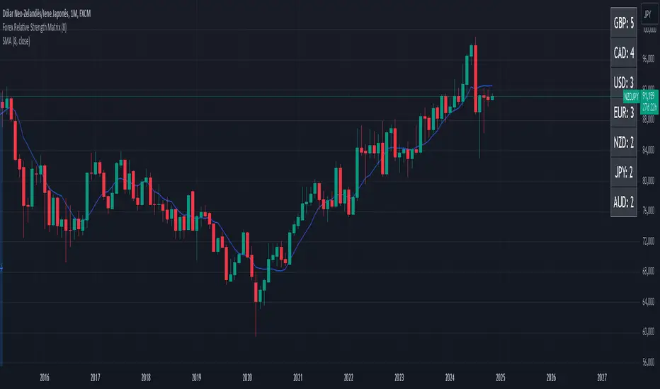
Forex Relative Strength MatrixTraders often feel uncertain about which Forex pair to open a position with. This indicator is designed to help in that regard.
This indicator was created as described in the book Swing Trading with Heiken Ashi and Stochastics. In the original, the author suggests using it for swing trading. The author recommends applying it to a monthly chart with an 8-period moving average to analyze the context.
The logic of the indicator is to measure the relative strength of each currency by checking if the price of each Forex pair is above or below a chosen moving average. If the price is above the moving average, the base currency is awarded 1 point, indicating strength. If below, it scores 0, indicating weakness. By accumulating points across multiple pairs, the indicator ranks currencies from strongest to weakest, helping traders identify potential pairs for trading.
Trend Identification:
After identifying relative strength, the trader should observe the general trend using a 100-period SMA on 4-hour charts. If the price is above the SMA, the trend is bullish; if below, it is bearish.
Buy Logic:
A buy is triggered when the base currency is strong (price is above the moving average) and the quote currency is weak (price is below the moving average). After identifying the trend direction, the entry is confirmed by a color change in Heiken Ashi candles (from red to green in an uptrend) and a stochastic crossover in the trend’s direction.
Sell Logic:
A sell is triggered when the base currency is weak (price is below the moving average) and the quote currency is strong (price is above the moving average). The sell entry is confirmed by a color change in Heiken Ashi candles (from green to red in a downtrend) and a stochastic crossover aligned with the trend.
Entry Chart:
The entry chart used is the 4-hour chart. The trader should look for entry signals following a pullback in the trend direction, using Heiken Ashi candles. Entry is made when the Heiken Ashi candles change color (from red to green in an uptrend) and there is a smooth crossover of the stochastic indicator in the trend’s direction.
It would also be possible to adapt the indicator for day trading strategies with targets of 1 to 2 days. Here is a recommended setup:
Relative Strength Identification (1-Hour Chart):
Instead of monthly charts, use a 1-hour chart to identify currency strength with a 20-period moving average.
The 20-period moving average on the 1-hour chart captures a balanced view of short- to medium-term direction, covering nearly a day’s worth of trading but with enough sensitivity for day trading.
General Trend (5-Minute Chart with 100 SMA):
On the 5-minute chart, observe the 100-period SMA to identify the general trend direction throughout the day.
Price above the 100 SMA indicates an uptrend, and below indicates a downtrend, confirming the movement in shorter timeframes.
Entry Chart and Signals (5-Minute Chart):
Use the 15-minute chart to look for entry opportunities, focusing on pullbacks in the main trend direction.
Entry Signals: Enter the position when Heiken Ashi candles change color in the trend direction (from red to green in an uptrend) and the stochastic indicator makes a smooth crossover in the trend’s direction.
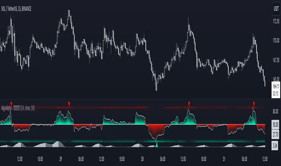
Volume Weighted Relative Strength Index (VWRSI) [AlgoAlpha]Volume Weighted Relative Strength Index 📈✨
The Volume Weighted Relative Strength Index (VWRSI) by AlgoAlpha enhances traditional RSI by incorporating volume weighting, providing a more nuanced view of market strength. It uses custom range detection to measure consolidation strength, applying dynamic scoring to highlight trend phases. The indicator includes customizable moving averages (SMA, EMA, WMA, VWMA) and color-coded visual cues for uptrends and downtrends. Additionally, it marks significant bullish and bearish trend points with symbols, making it easier to identify potential trading opportunities. This powerful tool helps traders make informed decisions by combining volume, price action, and trend analysis.
✨ Key Features :
📊 Volume-Weighted RSI : Combines RSI with volume for better accuracy.
🔄 Range Detection : Identifies consolidation phases.
🎨 Customizable MAs : Choose from various moving averages.
🔔 Alert Capabilities : Set notifications for trend points.
🚀 How to Use :
🛠 Add Indicator : Add the indicator to favorites, and customize the settings to suite your trading style.
📊 Analyze Market : Watch RSI and range score for trends.
🔔 Set Alerts : Get notified of bullish/bearish points.
✨ How It Works :
The Volume Weighted Relative Strength Index (VWRSI) combines traditional RSI with volume weighting to offer a more comprehensive view of market momentum. It calculates the RSI using the closing price, then weights it by volume to enhance the accuracy of the trend analysis. The indicator also includes a custom range detection feature that evaluates consolidation strength by dynamically scoring the RSI over a specified period. This scoring helps identify phases of strong trends and consolidations. Visual elements like color-coded trend fills and symbols for bullish and bearish points make it easier to spot key market movements and potential trading opportunities.
Stay ahead with VWRSI by AlgoAlpha! 📈💡
Dow Factor Relative Strength IndexThis script was written to create a new, rapid relative strength index inspired by the Dow Theory.
More info about Dow Theory : www.investopedia.com
According to the Dow Theory, volume should confirm market trends.
The correlation coefficient between prices and volume is negative in weakening trends and negative trends , positive in strengthening or positive trends.a factor was formed based on the correlation coefficient between volume and prices.
This factor was added to the relative strength index.
Period 5 is selected because the volume is very volatile and can be slow.
You can use the period you want, but I recommend the period as a minimum of 5.
It is suitable for all instruments and timeframes and thanks to its design, it provides control over gradual buying and selling points.
I haven't fully tested it, it's open to updates. For now, just use it to create ideas.
If I find it necessary,
I'll update after the tests.
If you have suggestions on these issues,
Leave your comments in the comment window.
This code is open source under the MIT license. If you have any improvements or corrections to suggest, please send me a pull request via the github repository github.com
Stay tuned , best regards.
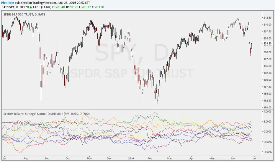
Sectors Relative Strength Normal DistributionI wrote this indicator as an attempt to see the Relative Strengths of different sectors in the same scale, but there is also other ways to do that.
This indicator plots the normal distribution for the 10 sectors of the SPY for the last X bars of the selected resolution, based on the selected comparative security. It shows which sectors are outperforming and underperforming the SPY (or any other security) relatively to each other by the given deviation.